Project Goals
Sweet Pickle Books needed a brand reposition to communicate that they were both a bookstore as well as a community space. Their new brand is built to be just as friendly, inviting and earnest as the book store itself.
The Challenge
The original logo of Sweet Pickle Books didn't convey much about the shop beyond the name. Considering the store trades used books and pickles alike, it needed something that could encompass those elements in its brand identity.
The Solution
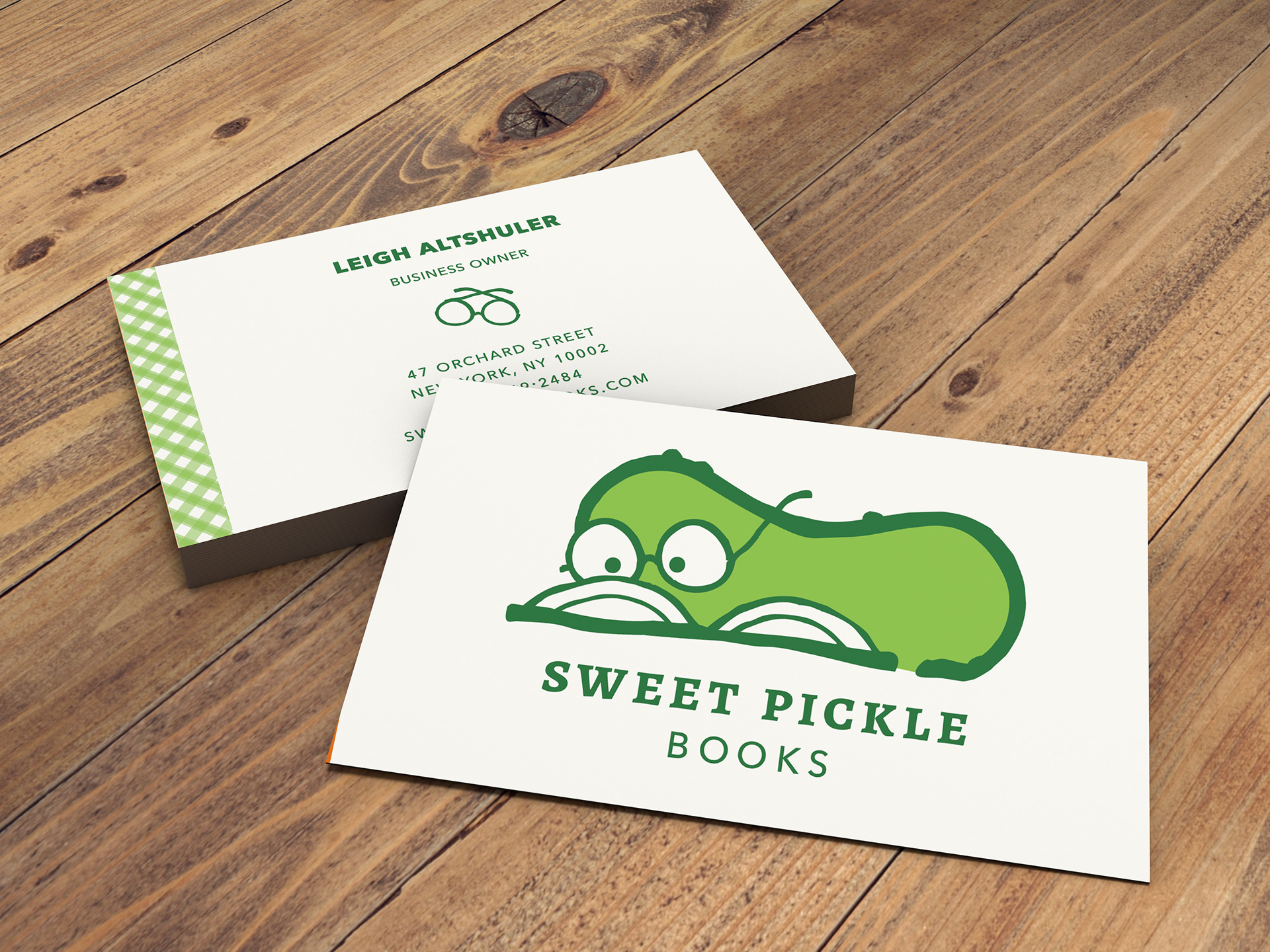
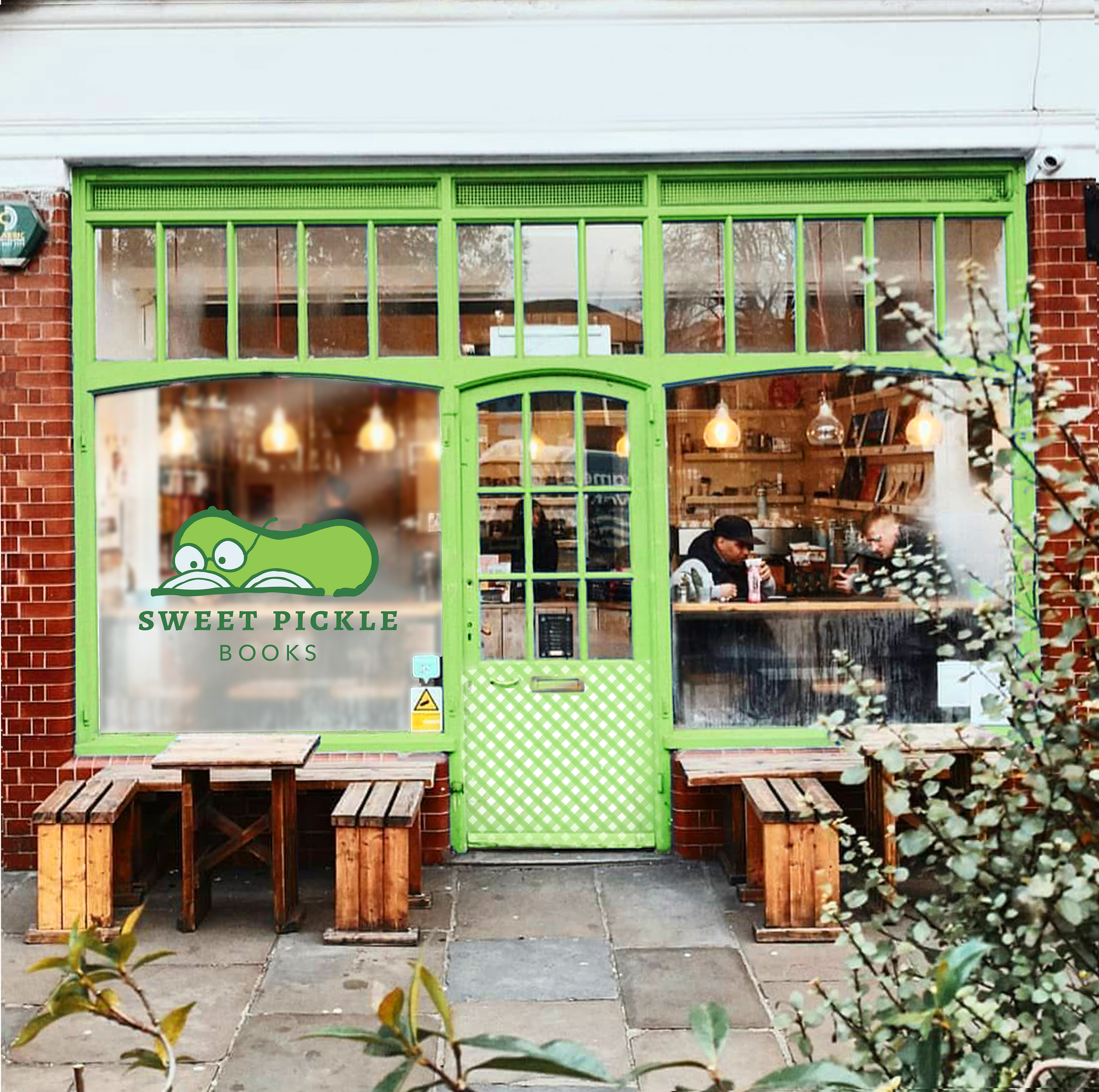
In order to embody the atmosphere of the bookstore, the new brand identity now revolves around a more friendly, earnest, approachable mascot named Capers. This mascot succintly represents all that Sweet Pickle Books has to offer while being a friendly addition to the local neighborhood.
Inspirations
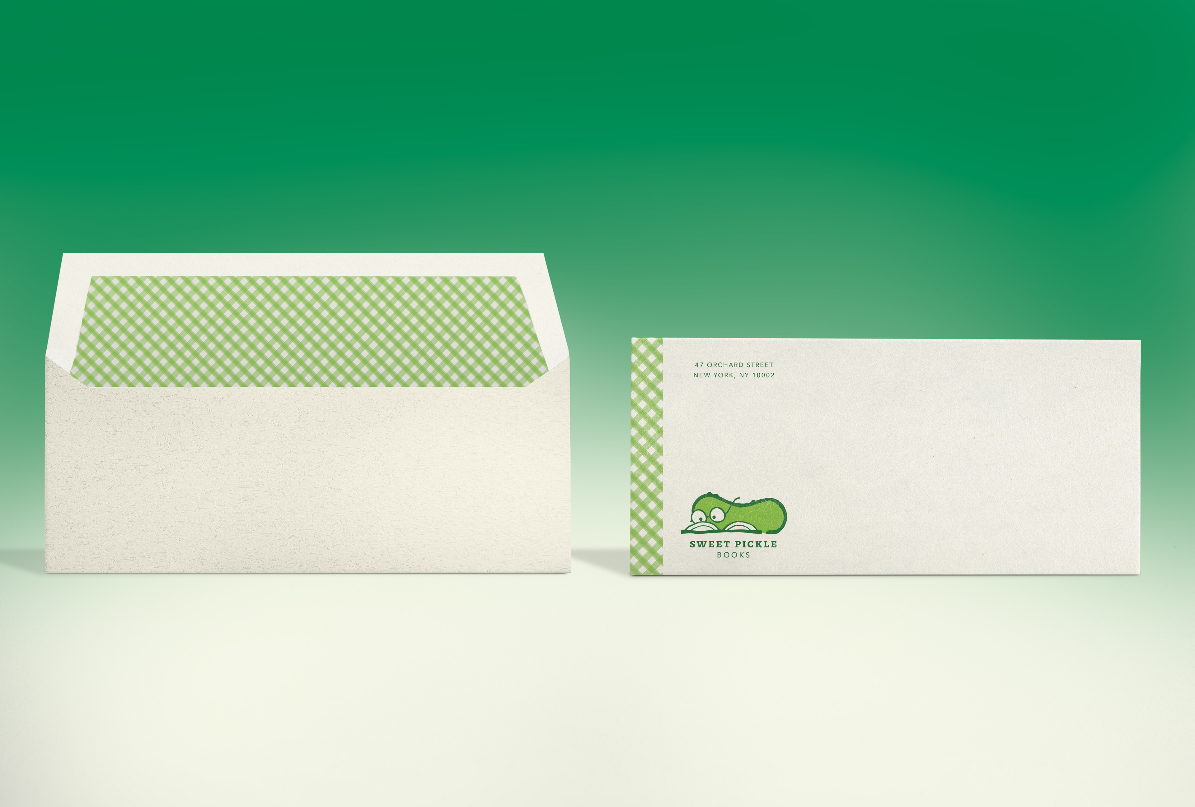
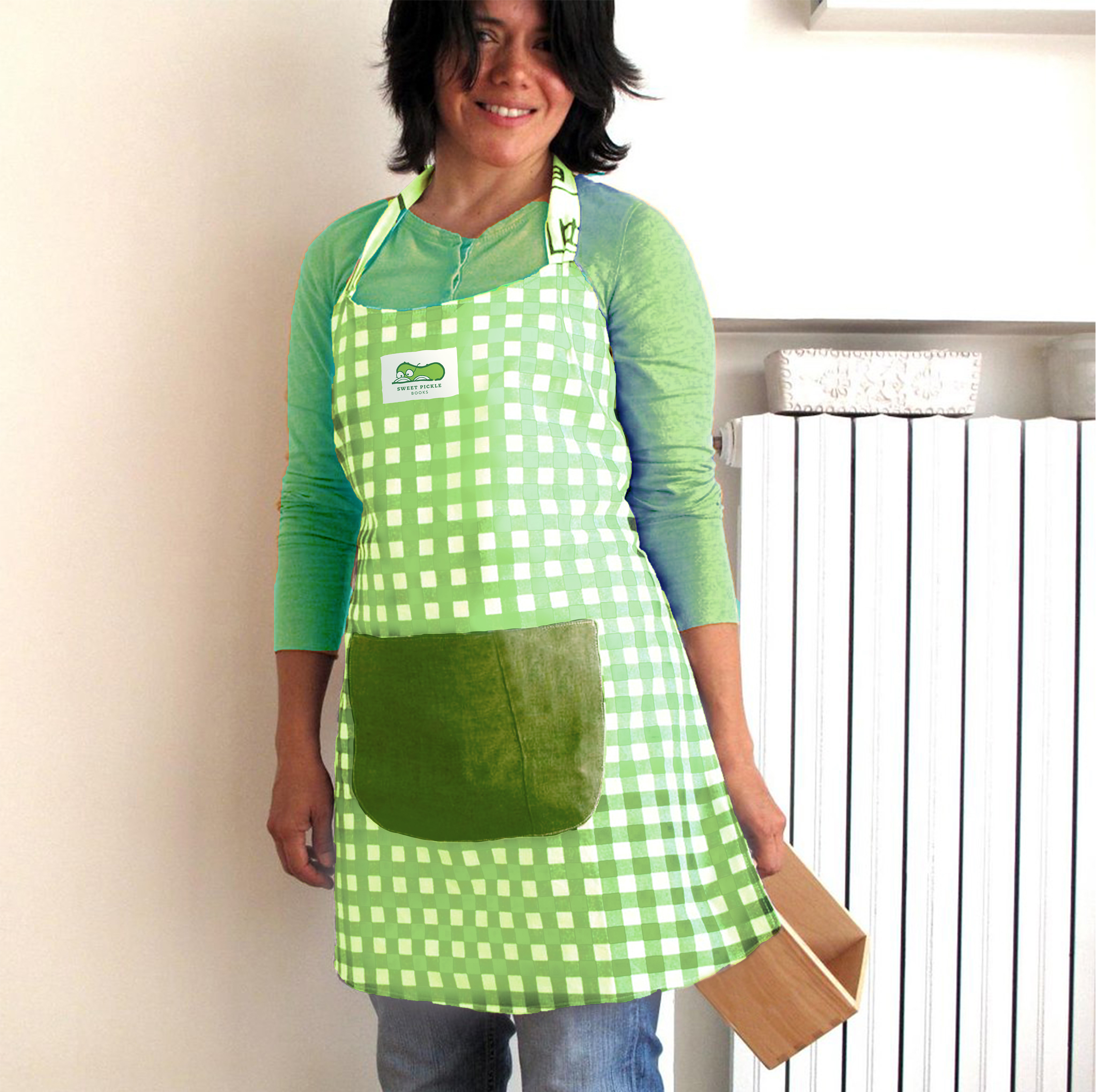
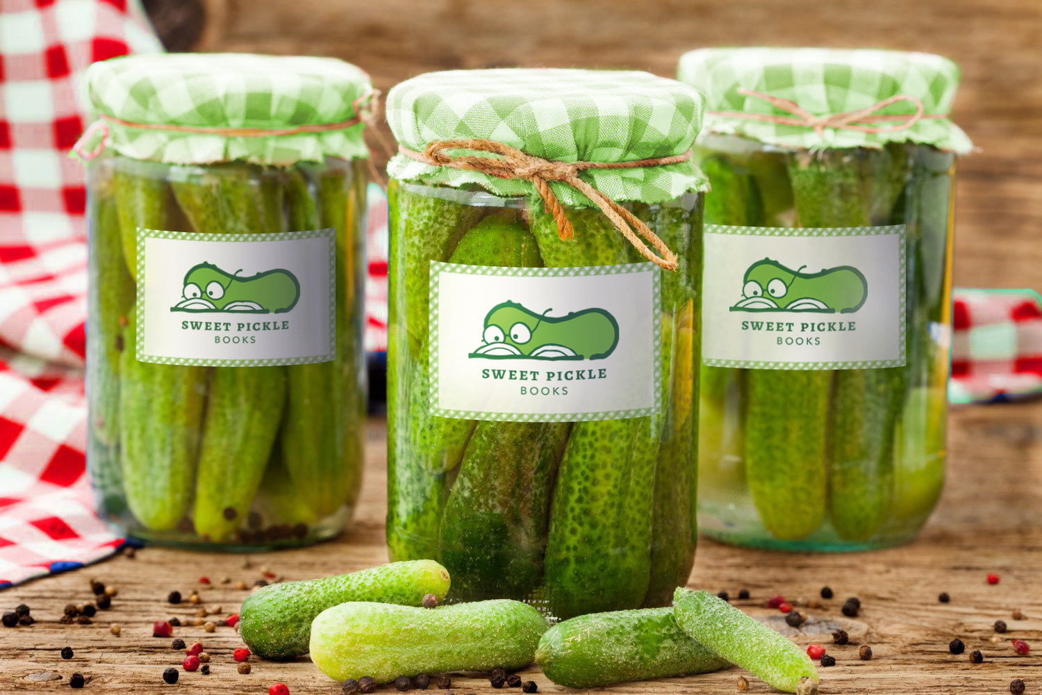
The branding elements for Sweet Pickle Books are a combination of the pickling industry and antique books. In the pickling industry, gingham pattern and mascots are a part of design language that conveys authenticity or homemade quality. However, the textures and type for the logo are more in the realm of books and paper. Alegrya SC draws its inspiration from Rennaisance and Baroque typography, giving the brand a booklike quality.

Collateral and Colors
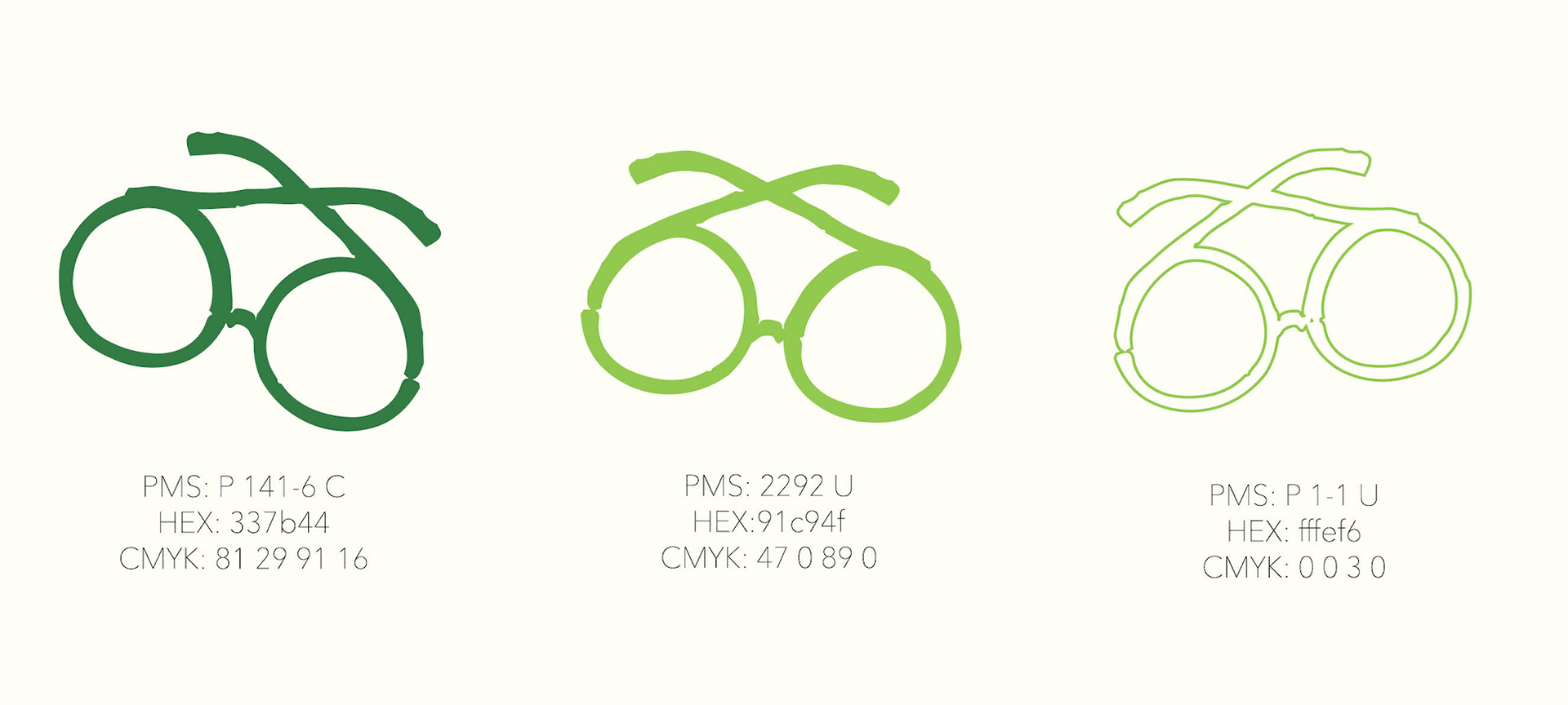
Though both of the greens relate to pickles, the Lime green in particular is an energetic color that reflects the active community of Sweet Pickle Books. Moreover, the speckle tone paper is a nod to the way older paperback books would be printed on speckled paper.
Effectiveness
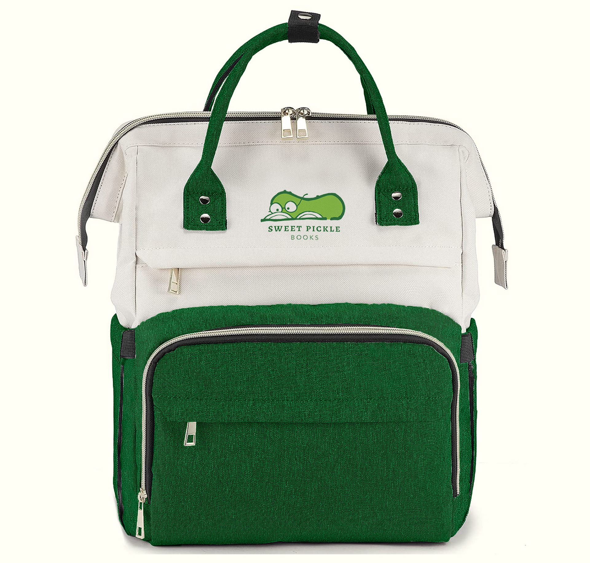
In a sample group of 30 people from the target audience, more than half had a positive reaction to the new logo before they even properly walked over to see what it was. Considering the true value of Sweet Pickle Books is in it's community development, this curiosity and delight is a good indicator that the rebranding will do good in the eyes of the store's beloved patrons.
